
Changing the temperature in your car used to be as simple as turning a knob. Warm air flowed. And, crucially, your eyes remained on the road.
Now, you’re poking at the dashboard like it’s a touchscreen coffee machine that won’t give you what you asked for. It’s been decided that buttons are dated. In their place come shiny black rectangles reflecting fingerprints and your rising frustration. That’s what happens when designers trade buttons for style over sense.
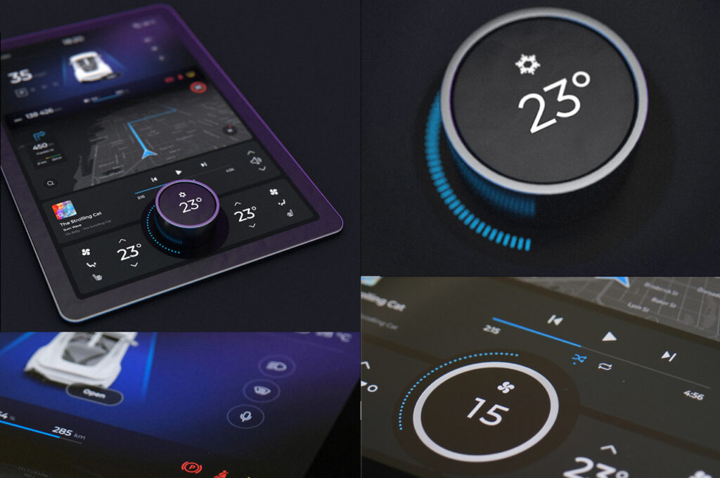
Touchscreens make car interiors more modern and cleaner, reduce clutter, and allow software updates—all very clever if you’re not driving the car!
But here’s the problem: touchscreens are slow, awkward, and dangerously distracting.
The Swedes tested it. A serious publication, Vi Bilägare, put 11 modern cars up against a 2005 Volvo V70—a relic, yes, but one with proper buttons. They asked drivers to complete four basic tasks: changing the radio, adjusting the climate, resetting the trip computer, and activating the defroster. All while cruising at 110 km/h (68 mph).
The Volvo completed the four tasks in 10 seconds. The driver stayed on task and covered just 306 meters.
That MG Marvel R took 44.6 seconds to travel 1,372 meters (nearly a mile). That’s not just bad; it’s dangerous.
Vi Bilägare isn’t the only one raising the alarm. The European Transport Safety Council says touch-based systems are slower and more distracting, making sense when operating a two-ton projectile at high speed.
Some manufacturers have started to admit this was all a bit daft.
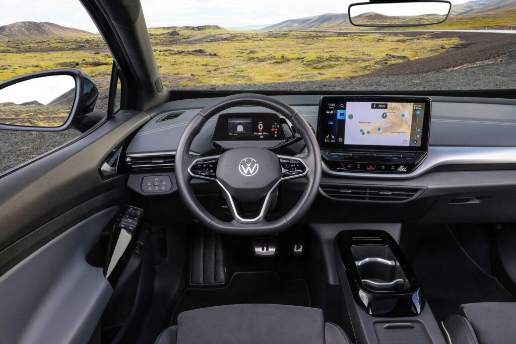
Take Volkswagen. With its ID.3 and ID.4, it buried climate and audio controls inside the screen. Then, just for fun, it made them touch-sensitive and unlit, rendering them useless in the dark. Unsurprisingly, owners weren’t thrilled. So, VW is backpedalling and has promised to return to proper physical buttons, starting with the ID 2all. It’s about time.
Others, like Mazda and Genesis, never made the switch. They stuck with actual dials and switches for core functions—and drivers, being sensible creatures, appreciated that.
Tesla, of course, is still marching in the opposite direction. In its world, everything—from the windscreen wipers to the headlights—is accessed through a screen. It’s meant to look futuristic, but it feels like operating a vending machine on a rollercoaster.
This isn’t just about safety. It’s about the feel of a car. A button has resistance. A knob turns with purpose. There’s feedback. There’s certainty. A touchscreen? It just sits there—dead, flat, and slightly smug. It doesn’t care what you want. It makes you look down and take your eyes off the road, and that’s the point at which cars stop being fun and start being a hazard.
So what’s the solution? Simple.
Use screens for what they’re good at: navigation, settings, and infotainment. Things you poke at while parked.
But give us buttons—actual buttons—for everything you need while driving: volume, temperature, lights, wipers, the essentials—the things you reach for when the weather turns or a song comes on that makes your ears bleed.
If you need to scroll through three menus to defrost your windscreen at 70 miles per hour, the car was not designed by someone who understands driving but who thinks they’re clever.
And they’re not.
Comments are closed.